How to interview a designer with the perfect design exercise
The design exercise
It’s simple in concept: You’re going to set up a well-scoped design problem and ask a candidate to solve it on the spot. It can take anywhere from 15–40 minutes depending on depth and complexity. It’s such a good technique because there’s no faking (like showing portfolio work from a big team effort) and when moderated well, it can simulate working together.
But crafting a good design problem is the hard part.
Ask for the impossible
The trick is to add constraints until the problem can’t be solved perfectly. If you’ve interviewed as a designer at Google, you’ve probably had to wrestle with designing an alarm clock with way too few buttons. The point of the design exercise is not whether someone can get the right answer; it’s to see how people think. And the best way to keep people thinking is to invent a problem that’s impossible to solve.
Create a level playing field
You don’t want someone to hit a home run just because they’re an expert in an area. So I ask candidates to design interfaces for either general audiences or niche audiences that the candidate is not familiar with (e.g. doctors, pilots, 3rd grade teachers). And I avoid domains where I’m an expert — because I’d be a bad judge of what’s easy or difficult.
Focus on a small set of skills
After looking at a candidate’s résumé and portfolio, you’ll get an idea of where they’re strong. Fill in the gaps by getting specific with a design exercise:
Product design exercise — Can they get beyond the interface and think holistically? Example question: How would you design an ATM for kids? Do candidates start with parents’ needs for teaching children about money, or do they dive into the interface?
UI Design exercise — Can they use existing widgets appropriately and invent their own when needed? Example question: Design a signup form with some easy data types, and some challenging ones (date ranges, colors, image uploads, etc.)
Information design exercise — Can they communicate difficult concepts clearly and layout a page? Example question: Design better MTA transit timetables, maps, and signage.
Interaction design exercise — Can they understand user goals and structure an interaction flow with the right feedback? I like focusing on interaction design because it’s needed on nearly every product, and because other design skills can often be seen in the portfolio. The only way I’ve found to judge interaction design skills is with a design exercise.
An interaction design exercise you can use
So you’re in a meeting room with a design candidate — just grab a whiteboard marker and say:
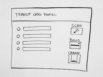
Let’s do a design exercise. Imagine we’re designing a kiosk at a transit stop. Its purpose is to let regular commuters refill their transit cards. We have an engineer coming in 20 minutes and he needs a spec. In that time, we need to explain exactly how this kiosk should work.
We’ve provided a design goal, user description, and time limit. Now start drawing the machine on the whiteboard and explain as we go.
This machine lets regular commuters re-fill their transit card with cash.
There are four push buttons, and a 40-character text display next to each button.
There’s a card reader, bill acceptor, and dollar-coin return.
Then just hand over the whiteboard marker, say something encouraging, and pay attention to what they do next.
Do they uncover constraints?
Experienced designers will ask a bunch of questions before suggesting a solution. They’re going to uncover and push on technical limitations. It’s great if candidates do this right away, before drawing a single thing. So you’ll need to have the details worked out in advance:
Actually the max allowed on a card is $50.
That dot on the bill acceptor? Oh yeah, that’s a light we can turn on and off.
The machine is right next to a station agent, who can help with anything.
I try to wait until candidates ask before revealing these details. But if someone is stumbling through solutions because they didn’t ask the right questions, I’ll jump in to help. (Don’t let a little mistake ruin the whole session.)
Do they define tasks?
Interaction design isn’t about the screens — it’s about supporting tasks through action-feedback loops. Good designers will clearly define the tasks, often by writing them out on the board. For this problem, the tasks might sound like this:
Refill card with all cash inserted (common case)
Refill card with some of cash inserted, issue change
Issue change when maximum value reached
Redirect to station agent on error
Some designers are deliberate thinkers, and list out all of the tasks before beginning to draw. Others are explorers — they’ll uncover tasks as they play with ideas. Both ways are fine. Occasionally I’ll meet a designer who doesn’t talk about tasks at all, but still comes up with a great solution. I actually worry about this last type. Even though they’ve found a good solution, it may be difficult for them to work with teams — if they can’t describe tasks and goals to others, critique sessions can get ugly fast.
Are they a visual thinker?
Writing an email or blog post is a great way to crystallize thoughts. Writing helps us think. And the act of drawing is the same — it helps us think through visual problems. You want a designer who is in the habit of thinking visually and feels comfortable drawing.
In this interview you’ve already drawn something on the board and handed the marker to the candidate. If they still don’t get up and start drawing, they’re probably not going to draw much on the job either, and that’ll make solving problems harder.
Are they full of ideas?
Great design requires generating lots of ideas, and then picking out the best ones. So look for designers who find several different approaches to the design exercise. Find people who can see a dozen crazy ways to solve the problem, and aren’t afraid to talk through each one. Avoid people who get stuck and can’t brainstorm their way out.
Can they critique their own work?
Look for people who are never satisfied. They should be able to see what’s wrong with a design and then try to find something better. Some people do this naturally — they’ll come up with a solution and then, without hesitation, list all its faults. If people don’t do this, I’ll gently prompt by asking, “What could be better?” And if a candidate ever gets too sure of any given solution, shake things up a bit. Say something like:
Imagine we put your design into the field, and we found people were scanning a card, inserting a bill, and then walking away without seeing any follow up screens. What problems does that create? How would you solve them?
JIM BUCKELS LEIF PODHASKY TOILETPAPERMAGADDITION d and a d feathr secret 7
Using the list of websites provided below, identify and respond to a range of competition briefs that reflect your emerging creative interests and professional ambitions within Graphic Design. You will need to select one main brief that will become the focus of the taught sessions and studio workshops for the duration of the first part of this module.
In addition to this you will need to select a number of smaller/quicker briefs that will allow you to demonstrate your ability to develop effective responses within professionally realistic deadlines
Level 4 took time to adjust too, the amount of briefs kept piling up I wasn't used to trying to manage this level of work-load in such a short period of time. Analysing my main drawbacks from last year, the recurring issues really came down to my failures in time management. Not booking vital printing sessions can be used as an example, as this delayed the overall completion time of my hand-in, by not prioritising tasks certain parts of the production process had to be held back.
This year certain plans will be made before even starting a brief. I will achieve this using my knowledge in Business Studies. I will use a tool used in business and include it in my own individual practice. Critical path analysis is a project management tool that uses network analysis to help manage complex time-sensitive operations. I see no reason why I cannot use this method. The essential concept behind Critical Path Analysis is that you cannot start some activities until others are finished. These activities need to be completed in a sequence, with each stage being more-or-less completed before the next stage can begin. These are 'sequential' activities.
Critical Path Analysis is an effective and powerful method of assessing:
What tasks must be carried out.
Where parallel activity can be performed.
The shortest time in which you can complete a project.
Resources needed to execute a project.
The sequence of activities, scheduling and timings involved.
Task priorities.
The most efficient way of shortening time on urgent projects.
This is the most efficient way of making sure I am managing time effectively and producing the best quality of work I can.
Talking mainly about how his musical influences are used in his design practice, inspired by album covers such as Motorhead Iron Fist and Iron Maiden cover.
Letraset enhanced his knowledge of graphic design
His interest and growing up in the punk movement inspired him to become a graphic designer, it was interesting to see this talk as it gives you a scope into what the real world practice of graphic design entails it was quite shit to know that aspects such as time management and workload do not become easier. But still a valuable insight into what the corporate/business side of graphic design entails. Rod Clark showed him the potential of graphic design with examples such as his swiss punk style in his magazine cover designs.
He spoke of employing people not based purely off talent, but their motivations and passions for design in general. Also stating that the study can burn you out with so much work, so he took a year out to travel which is a decision he doesn't regret. This is something I plan to do after I qualify from university, as way of taking a break from education.
Their Ethos: - Engage with young people in Leeds - Create a unique learning experience using new technology and non digital resources - Enable young people to become the producers of new media content - Empower young people to transfer and further develop their skills in new environments - Provide knowledge of and everyday access to the wide resources of the library service. They focus widely on the voice of the youth, and demonstrating this voice and perspective through digital means of communication.
Unique bright style that focuses on smiles, foundations, collaboration.. Social Enterprise is a main ethos of those focusing on improving communities and enhancing environments
Good to see their perspective, as it gives me further insight into how to proceed with responsive briefs. Focusing on really answering the question through further in-depth research. Interesting the opportunities and exposure they offer to creatives, getting your name out there, working with big companies such as Redbull, Adidas etc. Offering a wide range of opportunities, in broadening your target market, as well as guidance such as experimentation with new ideas. Their partnerships with external partners are successful and broad, successfully networking with other companies. How they work with agencies: - setting up digital platforms - hold talks on how to be a better manager YCN Student Awards: Why sponsors choose these awards: - real briefs are useful to students - boost to students future careers and cv's - the execution and caliber of the briefs are excellent - great opportunity for sponsors to reach their target audience - gives students an opportunity to see the real career brief side to their practice If you win the competition work will be viewed by all universities in the U.K Focus on market research around competitors in the market, to further enhance your idea How sharable moving content can be, it makes it much more accessible and brings what can be a boring concept, life to it. Facts: - Mission statement is their heritage dating back 1500's - Most exported water in the war - Sugar based drinks are declining in production, water is on the uprise as global health concerns rise. - Starting to struggle as a company, profits declining. - They need a sustainable approach - guaranteed donation every bottle - most successful charity water brands They lack in branding, which could be a fault to decline in customer purchase. They need a branding identity which could stand out from competitors, whilst still indicating its friendly, positive, charity driven image. Their design at the moment is very childish. Their positioning: Smart and confident Casual and witty Demographic of 18-40 year olds with a female bias.
Overall the main principle learnings I have taken from Responsive module is the ability to take initiative and work within a professional environment. I can directly link all of them as learning experiences, each to their own merit. Through these briefs I have deepened my practice on time management. Certainly collaborating has broadened my cognitive understanding. I would like to understand coding more, as I believe it will be an important skill to have in the future, it is also a well paying sector in the working industries. I have seen some graduate internship jobs going for as high as £40,000 a year. So this is a potential prospect. Which is another major point in my learnings from these briefs. I have shown my true direction in these modules. In the future I do not see myself in one specific role. I don’t want to label myself as a graphic designer because there are many other creative outlets I shall pursue. Which I made a huge point of in my presentation. These briefs were an example of this. I do not have the same skills as an interior designer but in my interior design brief I used my skills as a graphic designer and put it to a different practice. Which also can make my style in this sector unique, and separates me from my competitors. In this brief I have discovered future prospects through self discovery, really taking control of my learning and drawing a creative path to follow into next year. I don’t think I have a distinctive style which I prefer as I would like to be as versatile as possible as a creative. This brief showed my versatility, and strengthened it as well as teach me to revaluate my social skills and perhaps next time to enforce my ideology further, instead of shying away from a conflict of interests.
Overall this brief has been very refreshing from the normal procedures of my working routine. Taking a more hands on approach to my work, rather than just working purely computer based, working with different materials and textures. The biggest bonus from this brief was working in a professional enviroment. Being able to communicate with other practioners in different creative disciplines was enlighting. I learnt a lot about professionalism, and appealing to the demands of the employer, through constant communication and feedback to ensure the job was being done correctly. It also helped me refine my cross-disciplinary approaches.
It was a much better way of collaborating in the workplace than the other collaboration brief. This was mainly due to everyone having clear concise roles to achieve. All aiding each other with their own specific skill-sets. This was less apparent in the student collaboration brief, due to the unproffessionalism, and general less organisation. This brief felt like you were bringing more to the table personally.
It was also good to have constant support from the interior designer working together to achieve the goal. Not having to create everything off my own back was quite refreshing, instead the hotel hired contractors to create the designs, my goal was to design, innovate and imagine.
Overall I believe I have achieved the requirements of the brief, by creating a design that presents a positive vision of the post-Brexit UK world. Amongst all the backlash right now my design works to create a sense of unity and ‘britishness’ to the design. Creating a design with relevancy, and following the design trend of minimalism, creates a stylish elegant product. The colours are subtle and aesthetically. Through thorough research of the British colour chart, and understanding British typography I have successfully implied the British culture in my design, whilst providing a statement. Overall a very successful redesign with modern values of design implied. United Kingdom nationals can once again feel pride and self-confidence in their own nationality when travelling, just as the Swiss and Americans can do. National identity matters and there is no better way of demonstrating this today than by bringing back this much-loved national symbol when travelling overseas.
On average, a person spends 5-8 seconds on an interesting cover. The front cover ellicits such a powerful response that a potential buyer has the gut reaction to flip over and read the back cover to see the full work of art. It is more likely the reader spends more time on the back cover so if you manage to convince the reader to flip the book over and read the content you are more likely to make a sale. That is the purpose and power of a book cover design and I feel I have done that, whilst still understanding the needs of what penguin are asking in the brief:
- have an imaginative concept and original interpretation of the brief
- be competently executed with strong use of typography
The idea generation and working together to produce the animation was very enjoyable. Clashing with ideas going to and fro with which idea we should or should not make. Clashing with styles and finding new ways of working. These were processes I enjoyed throughout the brief.
We managed to communicate regularly and merged our individual skill-sets to create something unique.
After under-going my other collaboration brief for responsive, I think I much preferred the proffessionalism in that brief in comparison. Everyone achieved their clear set goals and aspired to achieve something great. I believe were not successful in the latter.
The problems faced were aspects such as not having much of an in depth take on the course. Little to no research, not real deep context provided. This wasn’t something you could put a blame on due to the nature of our studies. I have learnt to produce designs with depth and context, spreading a message. He is much more free-minded and a free approach due to taking an illustration course I would imagine it’s much more free flowing and creative. This causes issues in the developmental stage and general process. As I would normally have a more in depth way of tackling the brief I tried his methods of interacting with a brief. Overall I believe it is interesting and you could probably get away with it in a less concise brief such as this but with more complex ones I am not sure it would. But the main reason this was so problematic was trying to convince my partner to develop the idea further, everything else could be solved with enough communication.
My Monotype Brief for D&AD was a very long-winded process. Taking over 50 hours and thats just for the animation! Due to the depth of the project I had to deepen my knowledge in applications. Learning the basics of coding was interesting and a skill that I would like to progress on. Creating an animation was not enjoyable due to its long-winded nature however the final piece is always rewarding, I like creating life through motion graphics in my work. I took this brief to take advantage of creating my first piece of ethical design. At the time Brexit was going on and Trump was running for president I wanted to voice my opinion, taking the First Things First manifesto into light. I enjoyed building a campaign, I found the marketing side of the brief very interesting to under-go. Overall I was happy with the final animation and brief, I believe I created a very typographical-led emotional,informed campaign based on a misunderstood notion in our politics and society, that works to leave you with insight and perhaps change original perception, with typography and motion graphics.
Do you read me? The store held a number of well designed book. Provided me with a lot of insight and inspiration. Although book design is not relevant to my future as a designer, I still hold an appreciation for it as an art form in itself.
Probably my favourite museum visit in Berlin. From the architecture of the site to the pop art prints available inside. Works of Lichenstein and Warhol's depiction of Mao were my favourite. Big vibrant pieces like that amaze me. It is not really relevant to my practice much however it does inspire me to one day create a big scale piece.
This design studio involved a lot of editorial design. They had a particularly vintage style to them. Not too complicated but unique in it's own right. They focus more on minimal design, which is something I struggle with. I would like to create some minimal design but I always have the feeling of it being unfinished, so it is difficult for me to entertain the idea, but something I should consider.
It was refreshing for this installation to be inside a graphic design studio, as it has no relevance to the subject but such a unique idea. Sound emerges through 4 flue pipes, and one reed pipe. Taking in wind velocities and directions, from 20 weather stations into a computer program that converts the data into impulses. For the visitor the instrument readings are recorded in sync at various locations around the world and transferred into sounds make for a curious aesthetic experience. The artists who produced this often draw on information from specialists and scientists, in their efforts to produce vivid objective representations of complex processes in works that frequently recall experimental setups.
This experience was unlike any thing I have seen before. I still do not understand the relevance or point to it but it was good to witness alternative methods and inspiring ways to think outside of the box.
Studio 24/24 is an independant art direction studio based in Berlin founded by Antoine Enault + Ondine Vermenot. They develop unique concepts for prints and digital supports from individuals to institutions. They are open 24 hours a day!
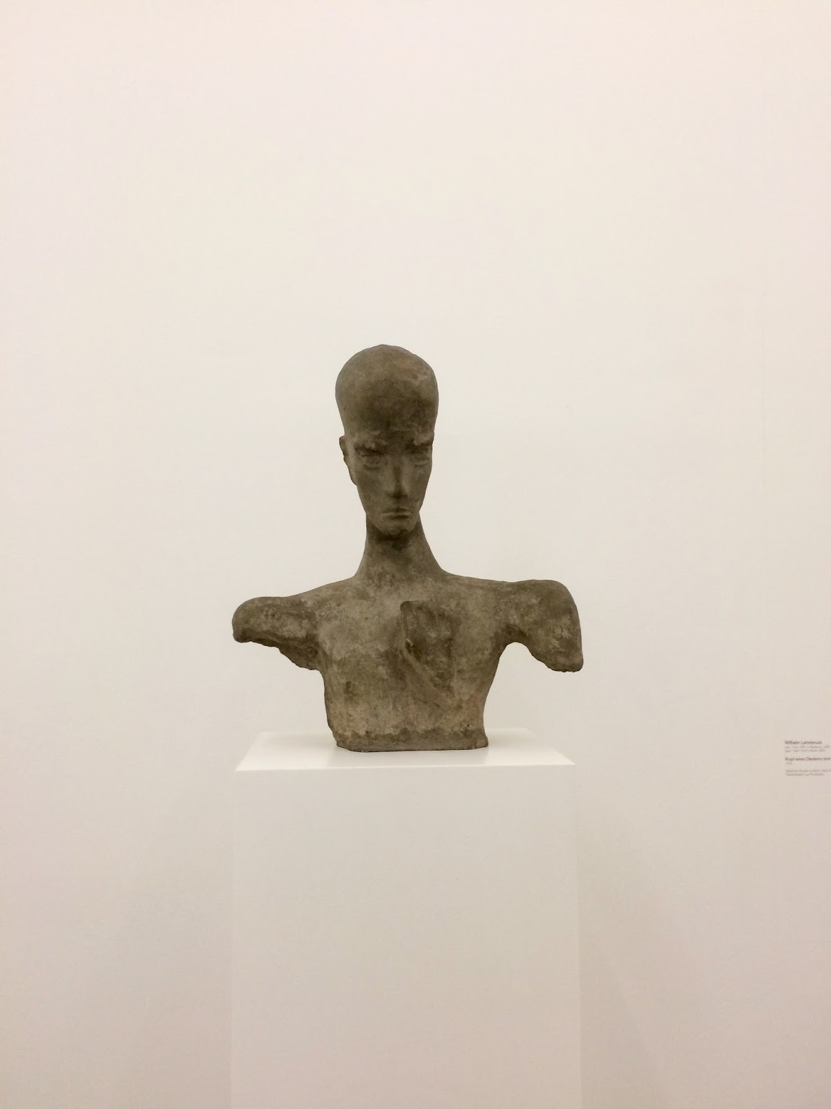
Domanović’s work is of both the past and the future, folding the aesthetic of classical sculpture into her investigation into how developing technology relates to the societies that create it. For Domanović technology is always gendered. Her sculptures are a collision of references that reflect the circulation and reception of images in digital media.
A thoughtful show illuminates an artist poised between the abstract and the figurative
“I have no idea where a drawing might lead,” Cragg tells us. “It’s a journey — an adventure.”
Cragg calls himself a “radical materialist”. Since the 1990s, when he stopped making sculpture from found objects, he has delighted in materials. The world is a giant storehouse offering endless possibilities to the artist, he says. Over the years, he has created different “families” of work, moving on from one to another with the door still ajar, in case he wants to come back. YSP’s show seeks connections between these different series, delving into the artist’s experimental approach, his relationship with his materials, and the handmade nature of his work. Cragg’s pieces may look like machine-made perfection, but he doesn’t outsource them to fabricators: everything is made in the studio by himself and his team.
The new Netflix series Abstract, tries to help people not only see the built, designed world, but understand how it gets that way.
In its best moments—and Abstract has many—the show is as satisfying as a great unboxing video or a teardown on YouTube: It cuts through the opacity of a finished product and helps you understand, if not entirely explain, why some things are attractive, why they work. But even better, the show does that by dealing as much with the maker as the made.
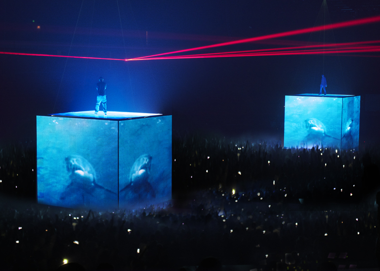
ES DEVLIN
“When artists and I talk about how they should first be seen,” she says, “I often think about it in the context of the conversation that’s being had around them in the public domain while we are planning the show.” The conversation during the planning of Miley Cyrus’s Bangerz tour in 2014 was all about twerking and tongues (Cyrus had a habit of sticking hers out at the general public). In response to the furore around Cyrus’s behaviour, Devlin suggested the singer “enter by sliding down a giant bright-pink slide version of the contentious tongue – a bright, bubblegum gesture as an antidote to toxic talk”.
When Es Devlin speaks about stage design, she could be talking about an ancient science: the distance between audience expectations and reality are "calibrated"; her collaborator Kanye West applies a kind of "medicine" to the proceedings; and a successful show is like a chemical reaction.