


Another brochure I have done for Oi designs team. This project simply involved putting the finishing touches on the publication. Looking into the typeface, I wanted something that replicated the style of homes they advertise. Lucinda Grande replicated the style I was going for.
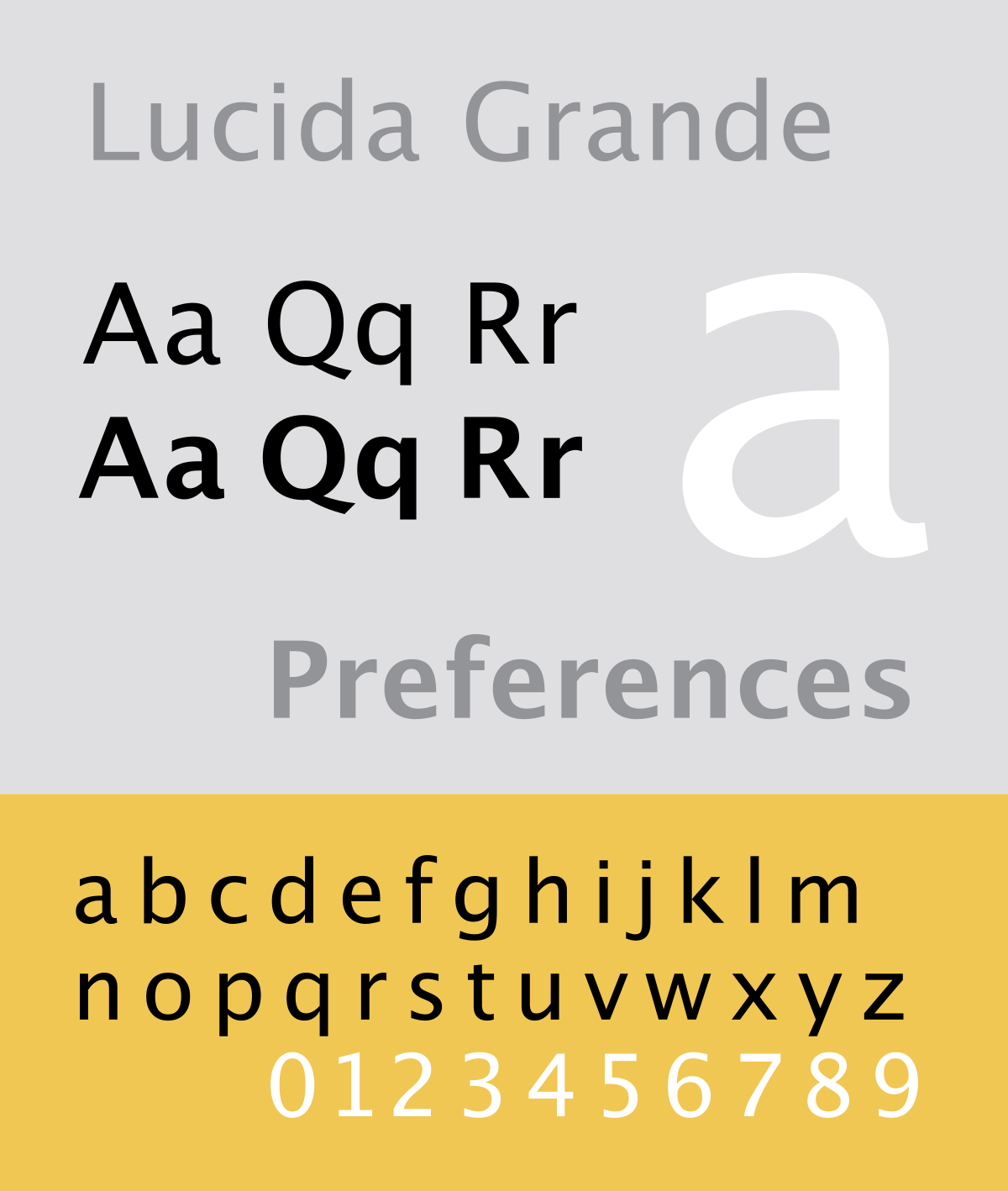
I wanted the typeface to emote architectural motifs. Lucinda is a sharp but sleek typeface. It is sharp and rigid with elements of sophistication applied it it's arches and curves. This is why I chose the typeface.
No comments:
Post a Comment